(E-E) Ev.g.e.n.i.j ..K.o.z.l.o.v Berlin |
|
home // E-E // biographie // art // eros // Leningrad 80s // Valentin Kozlov // 2 x 3m // events // sitemap // kontakt /
|
(E-E) Ev.g.e.n.i.j ..K.o.z.l.o.v Berlin |
|
home // E-E // biographie // art // eros // Leningrad 80s // Valentin Kozlov // 2 x 3m // events // sitemap // kontakt /
|
(E-E) Evgenij Kozlov: Leningrad 80s • No.117
|
• Sergey Kuryokhin and Pop Mekhanika – all documents |
|
(E-E) Evgenij Kozlov About Leningrad’s Art and Music Scene Questions: Sam Riley, Birmingham, as part of his PhD thesis about experimental music in Leningrad / Text and research: Hannelore Fobo, 16 October 2023.
Could you tell me the story of how Insect Culture (1987) came to be made? How was the design of the record created between yourself and ARK in the UK? I never had a personal contact with the people from ARK – not when I shot the pictures for Insect Culture in 1985, nor later, when the album was released in 1987. As far as I remember, everything went through Sergey Kuryokhin. Likewise, I cannot say what kind of arrangements Kuryokhin made with ARK Records and when. If it is true that ARK contacted Kuryokhin only after December 1985, when the BBC documentary on Kuryokhin “Comrades. All that Jazz” was broadcast in England, the question is why my Insect Culture photo shoot took place much earlier, in the late spring or summer of 1985, around the time Comrades was filmed in Leningrad. To my knowledge, the music was also recorded before the end of 1985. Concerning the picture for the cover, I decided everything on my own and knew that Kuryokhin trusted me fully. We had known each other for some time and he very much appreciated my art because it was both expressive and sophisticated; at the same time, it visualised the lightness and spontaneity he pursued in his performances. I think this is the reason why he asked me to create the cover for Insect Culture. Kuryokhin also knew that I had designed the cover for KINO’s 1984 album Nachalnik Kamchatki, The Chief of Kamchatka, which features, above a specially designed КИНО lettering, an elaborately painted photocollage with the band’s members more>>. At that time, I started combining photography and painting. I used black and white negative films because I could process them in my own laboratory more>>, and when looking at a black and white print, I knew how to paint it – I see colours more>>. Except for myself, no one in the non-official art-scene invested much time in creating a dummy the size of real cover, with front and back pages, as I did for Nachalnik Kamchatki, since there wasn’t the slightest chance to release a vinyl album through state monopolist Melodiya. Back then, all albums were released as magnetizdat, that is, on self-published reel-to-reel tapes more>>. Accordingly, the cardboard boxes holding the tapes were provided with a minimal design, normally some black and white picture and a bit of text. But I was looking to the future – in fact, my KINO design first appeared on a vinyl cover in 2021 more>> – and I didn’t want to impose any restrictions on myself. Kuryokhin was thinking big in music, and I was thinking big in art, that’s what connected us. For the Insect Culture album, I arranged another photo shoot, this time with a medium-format camera I had borrowed from a friend. I met Sergey Kuryokhin and New Composers Valery Alakhov and Igor Verichev, the main contributors to the album, in the centre of Leningrad, on Nevsky Avenue, and took the pictures in the street and inside the Passage shopping mall. At one of the staircases, the Passage had an installation with a mini space rocket next to a large mirror, which allowed to create interesting effects more>>. But I didn’t select the picture for the album cover myself; rather, I gave Kuryokhin a number of (painted) pictures to choose from. I wrote about it in my letter to Catherine Mannick from October 1985:
Popular Mechanics 'Insect Culture' Популярная Механика 'Насекомая Культура'
Contrary to my expectations, the record was released only two years later. To my surprise, the cover was printed with one of my unpainted pictures, a view on the musicians as they are walking inside the “Passage”, taken from a pedestrian bridge on the first floor. The picture does display some additional features – black and white dots and grids adding depth and rhythm. I drew them into the negative with the help of a needle or pencil while processing the film, a technique I used throughout the 1980s. The needle removes the moist emulsion from the transparent support layer, and the emulsion then clots next to these blank spaces. In the print, this effect leads to beautiful black and white contrasts, like in an engraving. Colin Fallows designed the script for the front cover, and he also designed the back cover.
A different picture from my photo shoot appeared with an Insect Culture review in Blitz Magazine, July 1987. I recently found out that it was one of my painted pictures when I saw a colour reproduction of the page. I had actually thought that Kuryokhin had forwarded ARK only some black and white prints of the photo shoot and had kept the painted pictures to himself – he liked them very much and understood their value in the history of Leningrad art. However, Anastasia Kuryokhina, Sergey’s widow, said they are not part of their collection. Apparently, they are not with Colin Fallows, either, so I came to the conclusion that they were lost. I’m very glad that two of them recently reappeared in the archive of the Liverpool John Moores University, as a bequest from Pete Fulwell of ARK Records External link >>. One picture is in fact a shot with the mini space rocket, which inspired me to dress the three musicians in comfortable spacesuits and paint a helmet around Sergey Kuryokhin’s head. I also added numerous dots, arrows, and other motion lines, and the result is an animated, rhythmical multi-layer composition, like the sampled tunes of Insect Culture – a perfect cover. I would be great to have it printed for a re-release of Insect Culture.
Ideas sometimes take their time before they materialise. This year, two of my pictures with the New Composers from the same series, beautifully painted by Igor Verichev and Valery Alakhov, made it to the cover of another LP, imenno segodnya, imenno seychas. a compilation of twelve of their songs from the 1980s. Inside, as a supplement, there are more reproductions from this remarkable photo shoot.
First of all, I should say that the New Composers and I had been close friends since 1984 or so. They were big fans of my art and I was a big fan of their music – it was technically advanced, very smart, and with the Russian speech fragments, it was highly entertaining more>>. Although Igor Verichev and Valery Alakhov are known as the founders of the first Soviet electronic band, they started with tapes which they cut and reassembled, and they created loops with two band machines.
New Composers Valery Alakhov and Igor Verichev contributing with the sound
They were both very talented and very productive, and in my opinion, they were the most progressive band in the Soviet Union. When we met, I often had my camera with me, and when pictures of their early years are published in the press or in videos, they are mainly from my archive.
taz plan, kultur + programm für berlin, 08.11.-14.11 2018
Together and individually, Alakhov and Verichev appear in many of my painted photo collages and portraits from the 1980s, the most important being a large diptych from 1989, “Igor, peace between us? – Peace? No Way.” and “Valera. The Soul present Within Things.” more>> They are both in Finland, in a public and a private collection, respectively, and I hope they will join each other one day. Painted photo collages with the New Composers are, for instance, at Harvard University, more precisely, in the Davis Center for Russian and Eurasian Studies Special Collection, where they are a part of my correspondence with Catherine Mannick from 1979 to 1990 entitled USA-CCCP. Points of Contact more>>. Besides, Valery Alakhov’s silhouette taken from a picture from 1985 can still be seen in my present work.
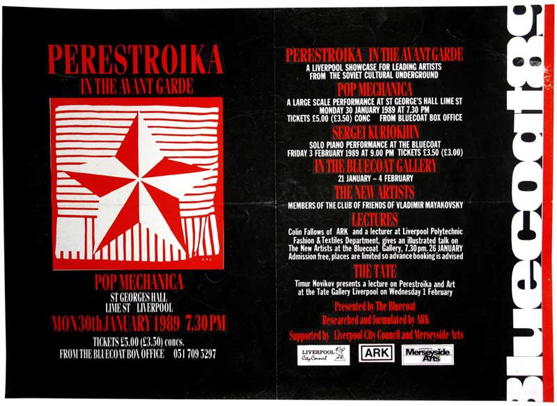
Since Valery, Igor and I saw each other quite often, they must have told me about the DOM project, but I cannot remember anything concrete. At any rate, the idea of involving me as a visual artist and designer makes sense, because ARK had enough material to present my portfolio to potential partners. Apart from the Insect Culture cover and at least two painted pictures from my Insect Culture series, the ones in the Pete Fulwell Archive, there was the poster from the 1989 Liverpool New Artists festival “Perestroika in the Avant-Garde” which showed my painting “Star”; the painting is now in the collection of Tate Modern. Another one of my works was on the catalogue cover and poster of the preceding New Artists festival in Stockholm in 1988, “Timur on Horseback”, one of my portraits of Timur Novikov more>>.
"Perestroika in the Avant-Garde" festival poster (Liverpool, 1989) featuring (E-E) Evgenij Kozlov‘s painting Star more >>.
Obviously, the DOM project never got to a stage where I was asked to make a concrete contribution, which I would have done gladly – not only with T-shirts, posters, videos and record designs, but with something more comprehensive, like the stage design and costumes Picasso created for the Ballets Russes. If we speak of the avant-garde spirit, immediately the Russian Ballets come to mind, because of their scale and novelty.
(E-E) Evgenij Kozlov at the Exhibition on Palace Bridge, Saint Petersburg, on the night from the 22nd to
I have always been interested in large-scale projects, because they allow you to develop new ideas in unexpected ways. When in 1989, I moved to a spacious studio in the centre of Leningrad – Russkoee Polee, The Russian Field – I was able to create paintings in a 2x3m format, like the monumental “New Classicals” cycle more >>. I also wanted to share the challenge of the large format with other artists and invited them to my studio, giving them a 2x3m canvas and paint. This is how I started to build up a collection of contemporary Russian art called “2x3m” more >>. Already in the summer of 1990, the first works in the collection were shown at a spectacular night-time exhibition on Palace Bridge close to the Hermitage. During the night, the bridge opens to let ships sail through, and the southern segment of the bridge was turned into a huge exhibition stand, lifting the paintings up to an almost vertical position more >>. Today the “2x3m” collection comprises almost fifty works in different media, representing all major Leningrad / Saint Petersburg art groups more >>. Returning to “The DOM Project“: the description mentions Dada and Cabaret Voltaire, but I would have expected that it also mentions the cosmos in some way or other, although, perhaps, this was intended with the reference to Futurism. At any rate, “cosmos” would have been more in line with ARK Records New Composers’ track “Sputnik of Life”, and, generally speaking, with the musicians’ interest in space and space travels. Some other songs reflect this, too, for instance “Orbital Station Alpha”, and so does the name they chose for their Planetarium club, “Science Fiction Society”. Of course, in the Soviet Union, science fiction had always been a very successful genre in film and literature. I myself was drawn by the subject, and in 1990, I painted “Love for the Cosmos” for the New Classicals cycle. In 2015, it went on the cover of another New Composers album, Start more >>. The painting is now also in the collection of Tate Modern.
In retrospect, it is difficult to judge the creative and financial potential of the DOM project. Without knowing who would have taken on the role of a modern Diaghilev, I cannot say whether it was more than wishful thinking. However, given the opportunity, I’m sure I could have done something very interesting.
a. Would you say that names such as ‘Club of the Friends of Mayakovsky’ reflected the artwork being produced by some artists? It goes without saying that all Leningrad artists were familiar with the historical avant-garde at least to some degree – Larionov, Goncharova, El Lissitzky, Rodchenko, Mayakovsky, Exter, Eisenstein… I’m just naming those whose names pop up spontaneously, but the list is actually very long, and they are all in my poem “Oracles on Orange Peel” from 1997. However, as I see it, the name “Club of Friends of Mayakovsky” was conceived in 1986 in the first place as a label intended to promote the New Artists – which it did more >>, especially outside the country more >> • more >>. Yet with few exceptions from the late 1980s, like Maya Khlobystina’s and Andrey Khlobystin’s textile panels, you wouldn’t recognise Mayakovsky’s stencilled ROSTA style in the “Friends’” works more >>. I myself used stencils in my painting since 1983, but not for agitprop purposes, like Mayakovsky more >>. However, if you take Mayakovsky’s name as a statement, then things look different. In this case, the “Club of Friends of Mayakovsky” becomes a placeholder for an ambitious project, namely that of repeating the achievement of the classical avant-garde. This has a positive and a negative side. The positive side is that it expresses confidence in pursuing one’s aim and the impulse to go ahead. The negative side is that of considering the Russian avant-garde as a national treasure trove to be exploited for patriotic matters. Let’s not forget that unlike, for instance, impressionism, avant-garde art basically has an aggressive character – all these angular, geometrical shapes – and that with the October revolution, this artistic straightforwardness was turned into an ideological weapon more >>. Therefore, the Leningrad art scene of the 1980s was caught between two contradictory positions. One the one hand, there was the desire to demonstrate that artists were catching up with the international art-world, and on the other hand the same artists were claiming leadership in art because of their roots. I took on a third, universal position, because in my understanding, neither historical nor current art movements are the property of any particularly country or nation – nor is there any need to teach the world who is the real avant-gardist.
It all depends on how you interpret the term “influence”, whether in a broader or in a narrower sense. In a broader sense, it’s the atmosphere that surrounds you in your everyday life – for me, rather than Soviet panel buildings, it was nature with its open horizons as well as baroque and neoclassical European architecture. I was living in Peterhof, the Russian Versailles, which fostered my sense for harmony, and I used to go fishing at Peter the Great’s pond in the gardens of Peterhof Palace more >>. It was a counterbalance to the busy life in urban Leningrad attracting me with its cultural scene, which also had an impact on my art. In a narrower sense, influence is what shows up in a stylistic analysis of your work without being a copy of something, so that’s a question to art-historians, in the first place. They will probably find a lot, because in the 1980s, I was driven by the desire to create a style reflecting the twentieth century. I experimented with a wide range of styles and techniques, from figurative-abstract images that included elements of folk-art to realism and constructivism. Graffiti art with script – I called it B(L)ack Art – and collage techniques played a major role, as well as my own photography, especially for my semi-realistic portraits more >>more >>. I didn’t restrict myself by following some ideology and fused different styles to create my own. As a regular visitor to the Hermitage, I was quite familiar with the history of art, but I also knew international trends fairly well, mainly through books. I still have my handwritten translation of Steve Hager’s book about the New York art-scene from 1986, “Art after Midnight”; if I remember well, it had reproductions of works by Jean-Michel Basquiat and Kenny Scharf more >>. Like all artists committed to their cause, I was striving for new expressions in art.
In my archive, there is a document from June 1989, an assignment to pay me 50 rubles for the logotype design for the Science Fiction Society. It is signed by its president Valery Alakhov and provided with two stamps, a square one and a round one. Both mention the Planetarium as the society's parent organisation, which means that the document was very official.
The fee must have been something like a third of an average wage, so I guess I went and fetched the money at the Planetariums’s accountant's department. I don’t know what was Valery’s budget at that time, but to my knowledge, the logotype never made it to a letterhead. I actually completely forgot about it until two years ago, when Valery gave his entire archive to the Petersburg branch of the Garage Archive. Following that, I was approached with a query by the Garage archivists to identify two unsigned Science Fiction logotype sketches. A script reading НАУЧНАЯ ФАНТАСТИКА, that is, Science Fiction, encircles a figure holding a large tool. The design is constructed with intersecting black and white circles and triangles, following the principle of a chessboard, and the second sketch has the black and white patterns reversed.
VISION magazine, China, no 175, August 2018, pp. 22-23
The constructivist style of the motif is identical to some of my logotype designs from the same period, therefore I guess the two sketches are really mine, although strangely enough, I cannot remember them. At that time, I was rebranding Soviet logotypes, just as the New Composers rebranded popular Soviet songs. For example, I turned around the hammer and sickle emblem by 45 degrees so that they are perceived as a nose and a mouth. With stars as eyes, the logo became a face displaying a bright smile – a perfect emoticon. I painted it on T-shirts and on canvas more >>.
Let me start with a brief comment on how I experienced these places. There was a big event at the Planetarium in March 1991 when Hannelore Fobo, my companion whom I had met a year earlier, exhibited her pictures of the Leningrad art-scene.
The same evening, there was also an exhibition of Oleg Maslov’s and Oleg Zaika‘s paintings, a presentation of Pirate Television videos, and Timur Novikov’s lecture. And of course, the evening was attended by Leningrad’s art “tusovka”, those hanging around with artists and musicians, and everyone danced to the music of the New Composers Watch Planetarium Partying on YouTube >>.
However, I didn’t go to the Planetarium very often, because starting in late 1989, when I opened Russkoee Polee, The Russian Field, at the legendary Fontanka 145 art squat, my studio quickly became a hot spot for foreign visitors, curators, TV companies and art lovers. Watch the German TV "Aspekte" documentary on the Leningrad Art Scene (1990) on YouTube >>
Leningrad, Fontanka River Embankment 145
For me, creation is a solitary process, and I had to find a way to protect the time spent on art, which always came first. I therefore put a do-not-disturb-before-midnight note next to my doorbell, which worked most of the time. When I wanted to make a break, all I had to do was leave the house, enter the next door, and walk up the staircase to the Tanzpol, where Alexei Haas or one of the other DJs would open the door for me.
The dance floor was nothing more than one room in a flat with some nice light effects and Georgy Guryanov’s painting of a muscular body builder (alternatively: a painting of two penises) hanging above the fireplace; Guryanov had his studio in the same building and was a regular Tanzpol visitor. He was also a big fan of my portraits and came to see me quite often. I don’t particularly enjoy dancing, but I knew almost everyone who was there and enjoyed being with them. As you can see in my video from 1991, everything was very easy-going and casual more >>. It was before organising rave parties became a business and started bringing in a lot of money. Both the Planetarium and the Tanzpol inherited the spirit of the 1980s, when everyone met everybody else all the time in the same public spaces – artists and musicians, dandies and punks, fashionistas and intellectuals. This doesn’t mean that you didn’t meet with people who weren’t involved in this world – in those years, my best friends were a schoolteacher, a barman, and a lawyer. However, Leningrad’s underground art and music scene orbited around a few places, like the Rock Club more >>, the Café Saigon more >>, the Youth Palace more >> • more >> and the NCh-VCh Club more >>. There simply were no other cool places to go, unless you had some money (most of us were always short of money). This hanging around with each other had a comfortable side, but it was also a sign of provincialism, which we ignored, because the city displays grandeur. When with the new times, old places like the Rock Club and Café Saigon had to close, while many new clubs, bars and cafés opened, this gradually led to a fragmentation of the former underground scene. What is more, a new generation emerged – people started going to different places according to taste, style, or attitude. But in 1990/1991, this hadn’t become very noticeable yet, neither at the Planetarium nor at the Tanzpol. In this respect, they could be called “popular” spaces. However, I don’t think we, the “people of action”, those who attracted the audiences at the Planetarium or the Tanzpol, considered ourselves as avant-garde, because in Russia, the term avant-garde connects you to the past, and we were living in the present with plans for the future. We wanted to do our own thing, independently of what we were told to do. There is a cliché called “a window of opportunity”, and perestroika gave us such an opportunity. We lived in a biotope of sorts, where we were the admired stars. We were successful in Leningrad, yet we couldn’t assess our achievements objectively, because after all, we had never entered into a real competition with people from the real world – the outside world. As consequence, a certain snobbishness evolved hiding in the disguise of wittiness, which struck me when I watched Kuryokhin in “Comrades. All that Jazz” Watch “Comrades. All that Jazz” on YouTube >>. In Russian, there is a word for this kind of wit – “stiob”. I love humour, and it’s present in my works, and I am also rather self-confident with respect to my art – I know what I’m doing. But I never shared this awkward stiob attitude, plus it’s potentially destructive to the creative process because it kills commitment. Besides, you wouldn’t find this kind of snobbishness in the avant-garde of the early twentieth century, and that’s one of the reasons I like it. If what ARK Records had in mind was to attract the western audiences with a genuinely unique and original Soviet product, then the New Composers were an excellent choice, because their music was smart and their humour was untainted. They were really exceptional – they were one of a kind! In my opinion, their music had the potential to become very popular outside the country, even though the subtleties of the wordplays would have been lost.
(E-E) Evgenij Kozlov
Uploaded 27 October, 2023 |
|||||||||||||||||||||||||||||||||||||||||||||||||||||||||||||||||||||||||||||||||||||||
|
|
|
home // E-E // biographie // art // eros // Leningrad 80s // Valentin Kozlov // 2 x 3m // events // sitemap // kontakt /
|